The typography used by your organisation forms an important part of your brand. So important in fact that it can elevate or undermine the messaging you put out into the world and the perception of your organisation as a whole.
Your website should be an extension of your brand since it is often the first interaction with your business or organisation that many people will experience. In conjunction with colour palettes, logos and user interface choices, the fonts that you choose are one of the main ways of conveying your visual identity and online presence.
So how do you go about making the best font choices? Luckily there are some guidelines you can follow to ensure a greater chance of success. And once you know those guidelines, it’s possible to push the boundaries a little to stand out — if that’s your desired aim.
Typography, typeface and font — what’s the difference?
We should first clarify the differences between these terms, even though they are very closely related.
Typography is the collective name for all type-related elements that form part of your brand voice and visual identity.
A typeface is a group of related fonts, whereas fonts individually are the weights and styles within that typeface family, such as Thin, Regular and Bold weights.
Serif and sans-serif
One of the most notable characteristics of a typeface is the style of decorative features at the ends of the strokes (or lines) of the letters. Put simply, typefaces that have decorative ends are referred to as “serif”, whereas those that don’t are “sans serif” (another way of saying “without serif”).
Serif font examples
Serif fonts are often used (although not exclusively) to give a more traditional or luxurious feel. Serifs have been used for a very long time and can be seen throughout history.


Sans serif font examples
Sans serif fonts typically denote a more modern aesthetic as the letterforms have been simplified, echoing minimalism. Their history is much shorter than serif fonts as their origin only dates back to the late 19th and early 20th centuries.


Making a choice
Like most things, typography has trends as certain styles fall in and out of favour. However, your typeface selection should reflect the values, tone and purpose of your brand, rather than simply what’s in vogue.
Most commonly you’ll need a headline and a body font that compliment each other. This doesn’t mean they have to be similar in style, since for example, serif headlines and sans-serif body copy can work extremely well together.
Like some sort of digital sommelier, there are great resources out there to help you with your font pairings. One of my favourites is TypeWolf, highlighting the type trending across a new site each day. Although at the time of writing the author is currently on hiatus, the archive provides a valuable trove of individual sites and a directory of each featured font. It’s this latter directory that is especially useful in our case as a font pairing will often be recommended. For example, the Apercu font page has a pairing suggestion of Freight Text. Once again mixing serif and sans serif for contrast.
Pushing the boundaries
Over the years it’s become increasingly feasible to utilise a huge variety of typefaces on websites thanks to self-hosting webfonts available for purchase or the ever expanding libraries of popular font hosting services such as Google Fonts and Adobe Fonts.
With this explosion in choice comes the pushing of boundaries. Typefaces with experimental designs and new ideas – particularly from smaller font foundries – offer exciting possibilities for something a bit different.
One of my favourite sites to see a wide range of new designs is FutureFonts, where designers sell fonts still in progress.
The best typefaces for a project are very much situational, as not just anything will work, and there is a risk of getting it very wrong. Particularly in relation to your brand and the message you want to convey. That said, there are opportunities for some organisations to mix things up a bit, depending on what their aims are and especially if they are launching a smaller project.
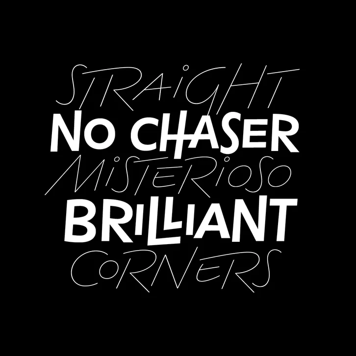
Kass from FutureFonts is an interesting example as it’s clearly quirky. I could see this working really well for the right project – perhaps a one-off campaign or initiative.
Need some guidance?
Typography forms an important part of your brand and should ideally be settled before working on your website. I can help with both your visual identity and your website design and development, so feel free to get in touch if you have a project in mind.