Many people are unaware of the impact the internet has on the environment. Every time you visit a web page, data – which includes code, text, images and video – is sent to your device from a server elsewhere in the world. And because this uses up electricity, it carries the cost of carbon emissions.
You can use the handy Website Carbon Calculator to estimate the carbon emissions of your website.
Doesn’t this depend on how my country generates electricity?
Indeed it does, and although fair strides have been made to decarbonise electricity generation, many countries are still far from where they need to be. In the UK for instance, the percentage of electricity generated from renewable sources, such as solar and wind power, fluctuates daily due to the weather conditions. See live stats on the National Grid via this handy visualisation website. During 2021, 41% of electricity generation in the UK was from fossil fuel sources. Yikes!
So what can I do in my corner of the internet?
There’s plenty you can do to lessen the impact of your website and it’s mainly to do with ‘performance’. Making your website more efficient and faster to load by avoiding wasteful bloat and using best-practice optimisations is key.
Here’s how I can help you make your website more sustainable.
Make sure your website is built on a modern foundation
It’s important that your website is built on a solid foundation with modern standards that ensure faster performance and a superior workflow for efficient development.
The modern way for sites to be built is with Jamstack architecture, which I talk about in this article. This is ideal for most of my clients. With such ‘static’ websites, pre-rendered content is served via a Content Distribution Network (CDN) for blazing-fast load times, better security (with fewer potential points of attack) and flexibility for your data with effortless scalability. This also has advantages for Search Engine Optimisation (SEO) as your visitors (and consequently search engine crawlers) will more quickly see the content of your site, rather than an empty page while it waits to load.
This site is built using the Nuxt framework, which allows for static site-builds with a powerful developer-friendly experience (so, this means the best of both worlds). There are many other options with some of the most well-known being Next, Eleventy and the more recent Astro, with Jamstack.org having a more comprehensive list.
Minimise unused code
JavaScript has evolved over the years to be the programming language of choice and, with all these framework options, it’s easy to fall into the trap of over-engineering your site. So it’s important to ask if you really need so much (potentially unnecessary) bloated code, especially if it’s a fairly simple site with a handful of pages and a blog, for instance.
Here are some ways I use to trim down on unnecessary code.
Build on the best foundation
This is one reason I prefer Jamstack architecture and the balance statically generated Nuxt provides, while minimising the size of the website in terms of code and network data usage. I’m also keeping my eye on the Astro framework, as it removes JavaScript delivered to the browser by default, only providing it when really needed using a partial-hydration methodology. It’s still early days so I am eagerly awaiting further development.
Use Lighthouse to pinpoint issues
The Google Chrome browser offers a performance and accessibility report via Lighthouse in the Developer tools. Open a site in Incognito mode (so your downloaded extensions won’t affect the result) and press ‘F12’ or open via the ‘More Tools’ > ‘Developer Tools’ menu. You can then run a report to see what score the website gets out of 100 in four main categories – Performance, Accessibility, Best Practices and Search Engine Optimisation (SEO).
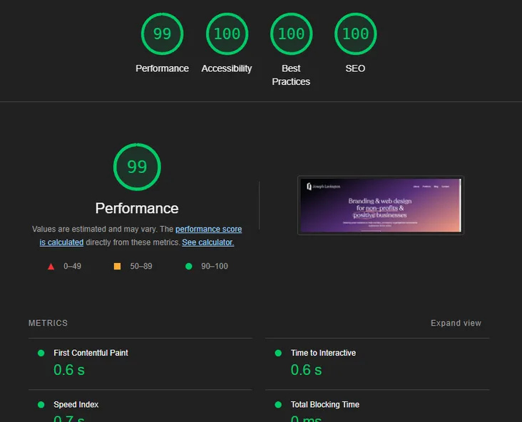
You should aim for green (a score higher than 90) in all four categories. The great thing is this report is very detailed and has information about the issue and how to fix it.
Write code with the clearest methodology
One main recommendation for sites is to reduce unused JavaScript code. This relates back to my point about engineering your site from solid foundations to minimise unnecessary bloat. This is also true of CSS (Cascading Style Sheets), which is the language used to style a website's structure and presentation.
It’s important to think about the methodology you will use to write your CSS. Work with its advantages (the cascade and inheritance) to enable simplicity and thus smaller file sizes of code delivered to the end user. CUBE CSS has emerged as an effective and easy-to-follow methodology, and is one I am increasingly embracing for new projects.
Watch out for third-party scripts
Even if you optimise your code, there’s still third-party scripts that can hamper your site’s performance. For example, things like Google Analytics can increase data transfer file-sizes and requests. Are my third parties green? has a great tool to check this particular area. If there’s one (or several!) culprits, then consider alternative services – Plausible for analytics, for instance – or even if you can remove them entirely.
Optimise your images
One of the most resource-intensive elements on a web page is images – something that can take up the bulk of your bandwidth. If you don’t optimise your images, they will increase loading times, but luckily there are several things you can do that will help.
Are your images the appropriate size?
There’s no point having massive pixel sizes if even the biggest screens only ever reach a particular maximum width. Avoid any big discrepancies between the original size of the image and the rendered size (what size your image ends up being on the page), as that will result in wasted bandwidth.
Are your images the correct format?
The JPG format (with the quality down to a comfortable level so as not to affect how it looks) and PNG are good options. However, the WebP format is usually the best choice, as it can reduce file sizes (compared to JPG and PNG) by as much as 25-35%, while offering both lossless and lossy compression (the latter is the technique used in JPG to reduce file sizes). SVGs are great for vector images (such as icons or logos) and will not lose quality no matter the width or height. These can also be animated.
Where are your images served?
It’s also important to serve images from a Content Distribution Network (CDN) provider where possible (if your website isn’t already hosted on such a platform), with one of the most well-known being Cloudinary. If your images are served from a CDN then you will reap the benefits of data being provided to your site visitors from geographically suitable servers and thus reducing load times.
How lazy are your images?
Browser support for lazy loading images is becoming increasingly well supported. The loading="lazy" attribute can be added to your HTML image tags to defer the image from being loaded until it is scrolled into view. You can check cross-browser support on caniuse.com.
If the above sounds like it involves a lot of work, there are ways to dynamically alter your images so you don’t have to continuously open Photoshop. As an example, since this site is built using the Nuxt framework, there is an add-on module called nuxt/image that can transform images and do much of the optimisation work for you.
Fine-tune your fonts
If you have the option of using fonts hosted on a Content Distribution Network (CDN) then use it. Google fonts are typically served in this way and have become popular due to their ease of use and wide choice.
For any custom fonts that are hosted locally, make sure you use Web Open Font Format (WOFF). If possible, subset your fonts or, in other words, remove the characters you know you won’t use. Font Squirrel has an online Webfont Generator tool so you can alter your fonts with fine-grain control, but be careful not to inhibit the functionality of your font!
Also consider whether you really need custom fonts. As a typography nerd I love a great typeface, but there are merits to using a ‘system font stack’. These days there are many well-designed fonts included with devices, so you can minimise the loading times of a custom font. See systemfontstack.com for a great list of fonts for your CSS.
No such thing as a free lunch cookie…
With GDPR regulations, it’s important to display a warning on your website if it uses cookies. Pop-ups, including cookie banners, can be annoying both from a user perspective as well as a performance standpoint. If you cut unnecessary waste from your site it may be possible to do away with cookies altogether and ditch the warning pop-ups.
Some third-party scripts use cookies for their functionality and make it harder to eliminate cookies (with perhaps the most common being Google Analytics). Consider an alternative analytics option, such as Plausible, since as well as helping with performance, it also doesn’t require cookies to work.
Can you help make my web presence more sustainable?
When it comes to making your website more sustainable, there’s a lot to consider, and it’s certainly an on-going learning process. I can help improve your website and make it better for the planet, so feel free to get in touch!